Ivy Leaves Journal Rebrand
As the only published voice for Anderson University students, the Ivy Leaves Journal of Literature and Art is a student-led publication that has existed for over one hundred years.
The rebranding of this publication was in collaboration with Brianna Elwell. We had the opportunity to ground Ivy Leaves in its rich, long history while also elevating it to communicate with modern audiences more editorially and expressively. We dove into the archives of previous publications and created a visual system that feels reminiscent of historical references.
Adobe Photoshop, Illustrator, and Indesign. All photos are not mine and are for conceptual purposes only.
Brand identity, publication design.
Ivy Leaves exists to elevate the ideas, talent, and passion of our students as something worthy of consideration, and the new system allows for this to be the case. While the journal is primarily meant to serve as a framework for the expressive nature of the literature and art pieces, the new direction also allows these feelings to be better conveyed by color, type, and imagery throughout the journal.
The Process
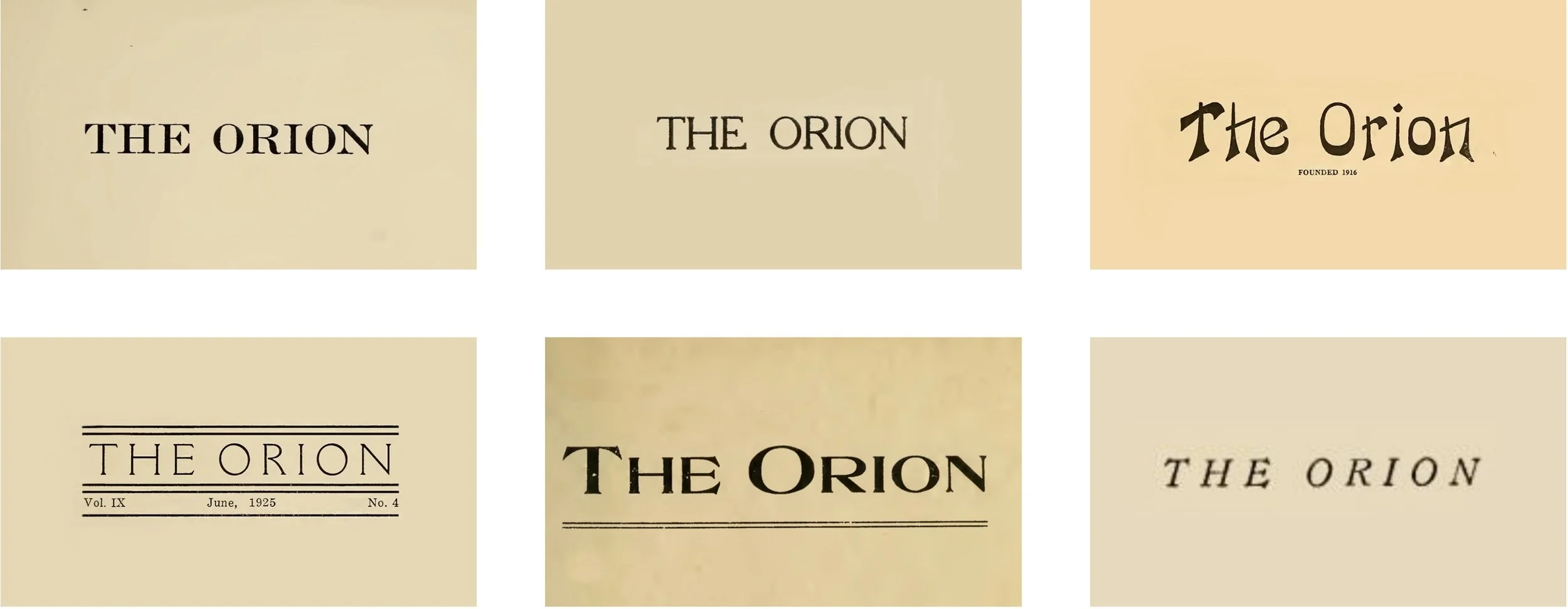
With origins dating back to 1916, the journal’s primary purpose was to serve as a voice for students; notably, it was a voice for women, since the institution was all-female at the time. The journal first came to life under the name The Orion, a reference to the mythological hunter, a shining symbol of individuality.
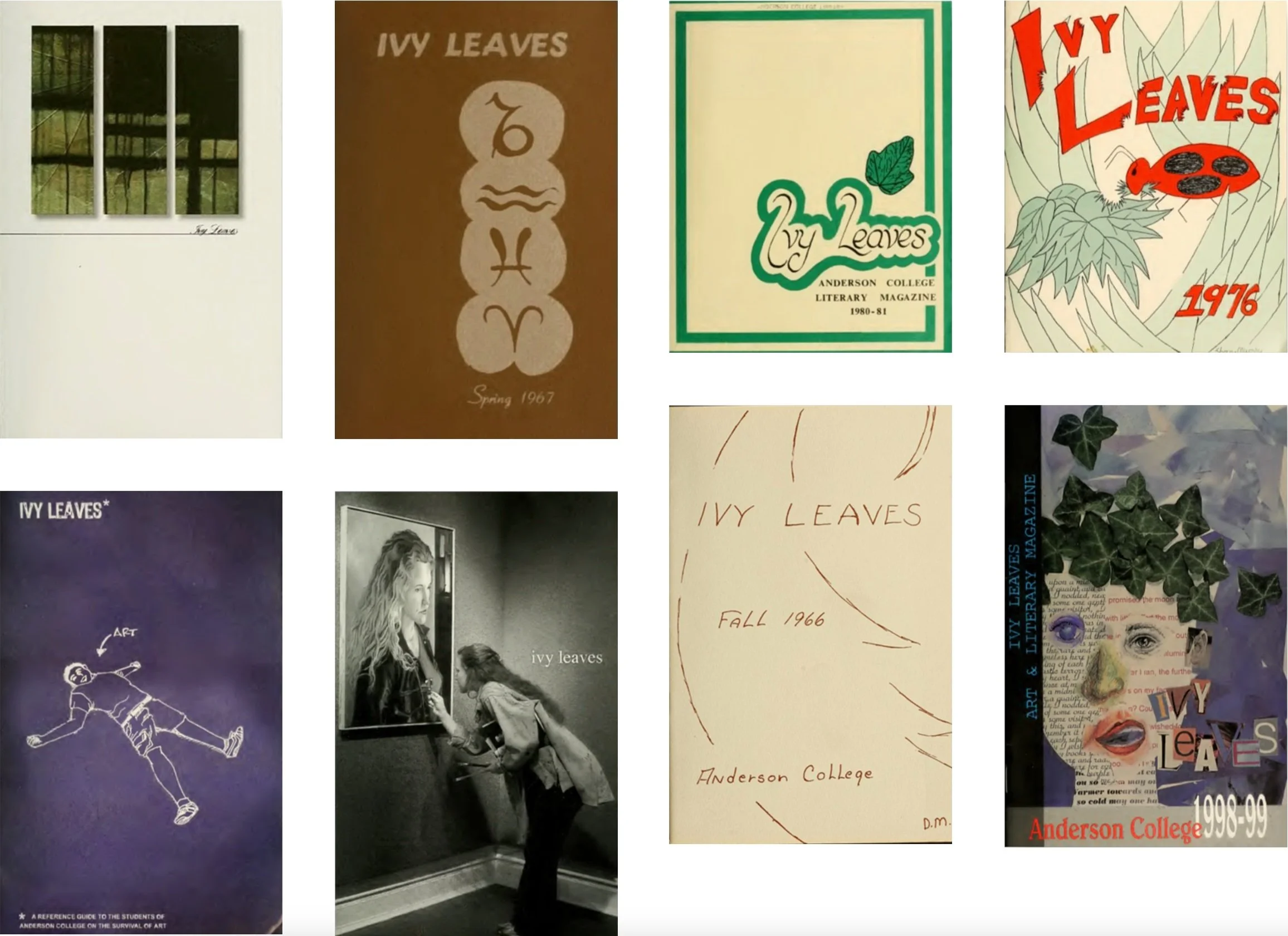
When the journal gained the name Ivy Leaves in 1964, its student-led nature became very evident. A key thing that struck us when looking through the archive was how much variety and expression could be found in each edition. Each felt like a time capsule of the life and emotions of the students they were representing.
In 2015, Ivy Leaves went through a major rebrand. While the variety of the journal allowed for student expression, it created a confusing brand identity and lacked professionalism. The new look—pictured below—created a more cohesive voice for Ivy Leaves, making the brand more recognizable.
However, as years passed, the journal and university grew in a way that felt disconnected from the visual system that was supposed to be representing them. In talking to many students, the general opinion was that the journal felt very academic, rather than a platform for individuality and self-expression.
The Solution
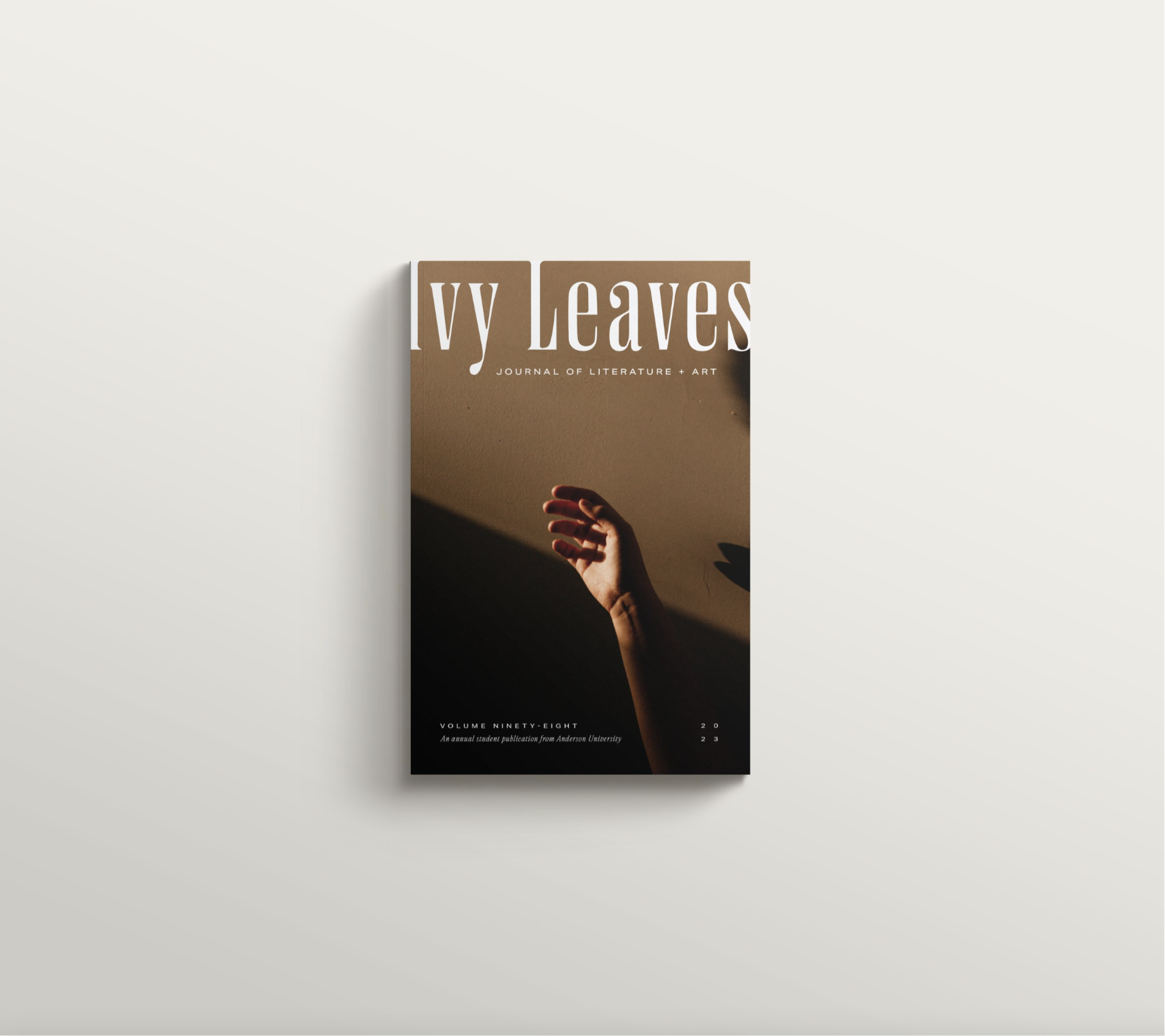
The solution was to push the journal in a thematic, editorial direction. A masthead design for the cover allows for imagery to be swapped out yearly based on the content of the journal, while maintaining a consistent and recognizable look across each edition.
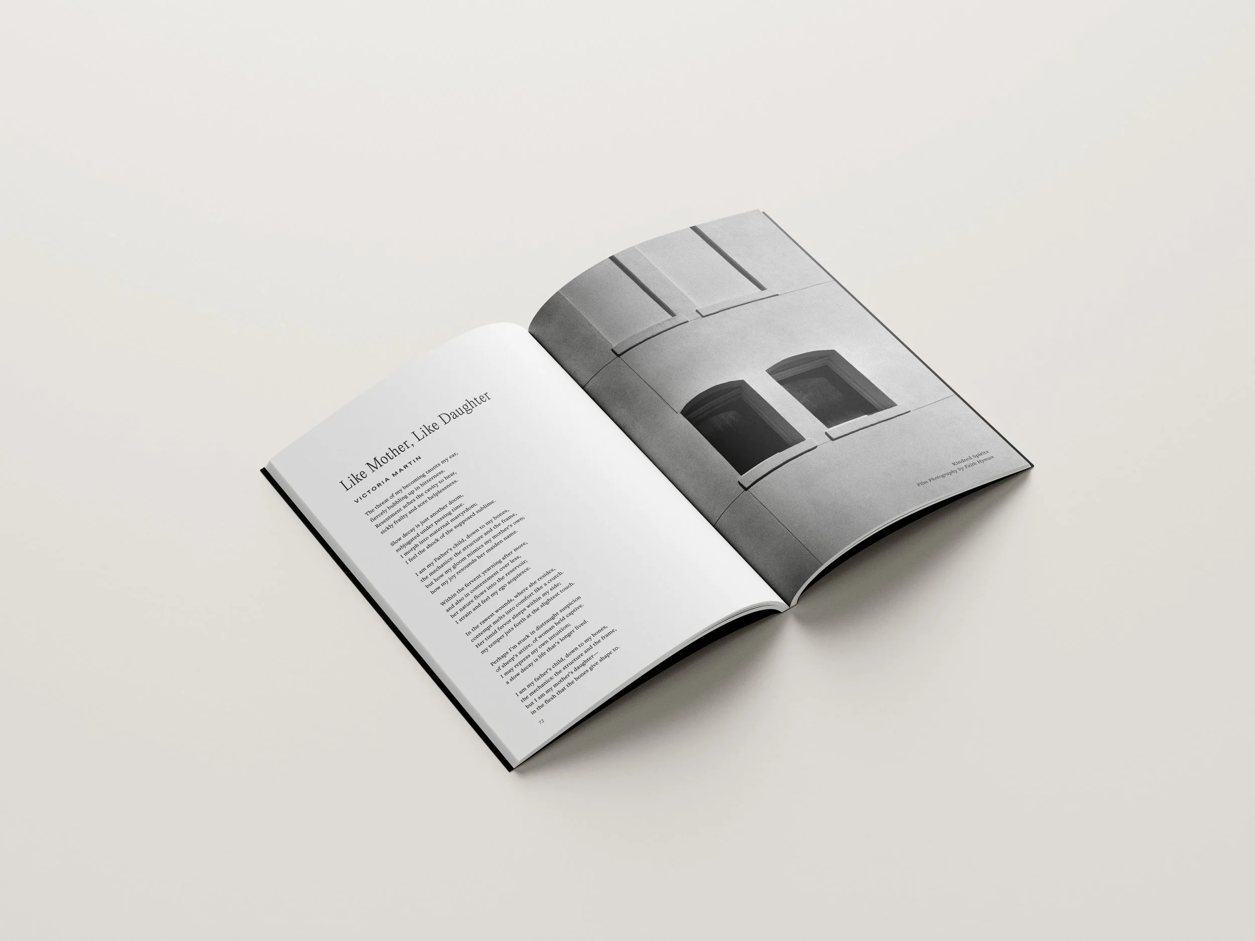
Typography choices are inspired by The Orion, while also having a modern, magazine feel. Previously, interior pages were systematic and lacked visual interest, only containing submitted artwork or literature. We created a system that allowed staff to visually explore the year’s theme with color, type, and imagery, without taking away from functionality.


